Your website is the foundation of your business as an auto dealer—your virtual showroom. Not only is it where you build your brand and differentiate yourself from the competition, but it’s also where customers come to view your vehicle description pages (VDP).
VDPs are also critical because your marketing usually ties back to them. Or at least it should!
However, most dealer websites don’t showcase their inventory well enough, missing golden opportunities to convert more from online traffic.
Let’s take a look at five big mistakes dealerships make online that cost them sales…
(1) Listing a Vehicle’s Full Price
There is a lot to be said about the psychology of pricing. Even seemingly small factors like color, font choice, and the size of prices on a webpage play a part.
But, there’s one fundamental truth to all pricing—people want to feel they’ve gotten a deal.
So if you’re listing a vehicle’s full price on the VDP, you’re likely scaring off customers. Instead, use something called “partitioned prices” by listing monthly payments instead. This also makes sense because consumers typically budget for auto payments on a monthly basis.
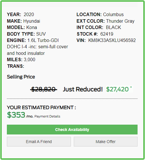
Another tip: Display a sale price next to the full monthly cost, with the discounted price below the full cost. This makes it easy for the consumer to see potential savings.
(2) Listing “Image Coming Soon” Instead of a Photo
There’s nothing worse than searching online for a car, getting a search result for your dream vehicle, and clicking through to see that dreaded placeholder: image coming soon.
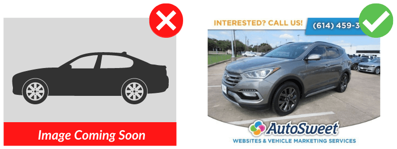
A high-quality photo inspires trust. No photo inspires… disappointment. It weakens your brand and your customer relationships. It also drives down VDPs views by 23%.
If you’ve automated your advertising, it’s possible that you’ve got some placeholder images on your website. But you’re better off not listing a vehicle at all until you have all the data necessary to do it right.
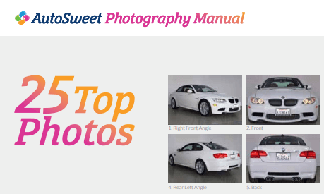
To learn more, check out this AutoSweet guide to displaying quality photos on your website.
(3) Using Minimal, Boring Descriptions
Car shoppers who visit your website want to know as much as possible about a vehicle before they buy it, and the VDP has the information they seek. Research shows that customers are more likely to engage with vehicles that are well-merchandised.
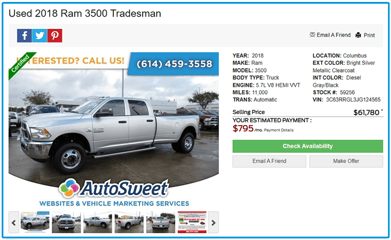
Include all the bells and whistles about each vehicle, as well as mileage, awards, ratings, testimonials, manuals, and more. It doesn’t have to be difficult. At AutoSweet, we include full options/specifications based on VIN, making the process seamless. AutoSweet also uses its SmartComments© tool to automatically add important text to your listings.
As a bonus, a robust VDP also heads off simple questions at the pass (“does this car have a sunroof?”). This can save you time when you’re super busy.
(4) Hard to Use Web Design
Do you park your inventory around the dealership lot in a scattered fashion, or line it up neatly facing the street? Just as you organize your vehicles on the lot, you should also keep your virtual showroom tidy and easy to use. Make it easy for people to shop your site with a clean web design.
Two common usability issues on dealer websites are contrast and font.
Contrast is the difference in color/tone between the page background and font color. It’s essential for easy reading. Big mistakes include:
- Light-colored text on a light background (doesn’t provide enough contrast for easy viewing)
- Clashing colors (which can also present contrast issues)
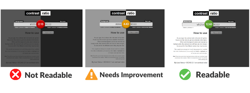
It’s simple to check your site’s contrast with this online contrast ratio tool. Just plug in your site’s HTML color names, hex codes, or RGB values. The colors on your website should score a ratio of 4.5:1 or better.
Besides contrast and colors, be sure you use a big enough font on your site. Body text should be around 14pt or 18px minimum for sufficient readability.
(5) Long, Complicated Forms
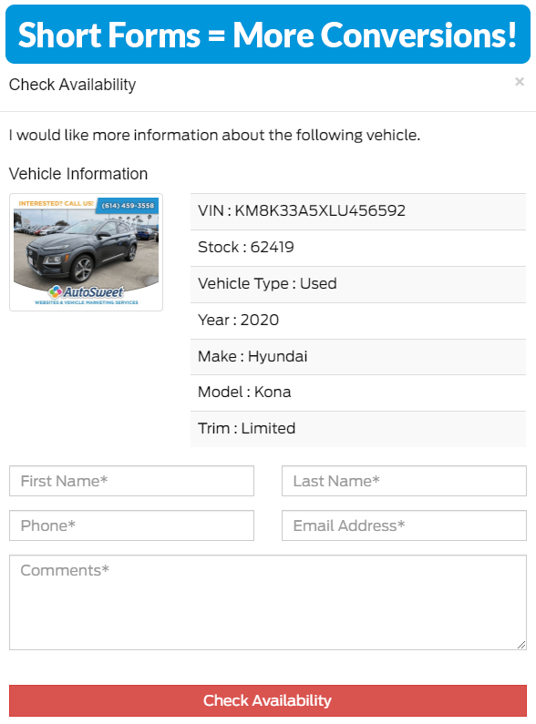
Most websites include simple forms to quickly connect interested shoppers with the sales team. Resist the temptation to add too many fields to your forms. Your goal is to get basic contact information so you can have a conversation offline.
The more fields you add to a form, the less likely they are to be filled out. If people click a link and get 20 questions, they’ll walk away, and you’ll lose a sale.
Keep your forms short and increase your leads and conversions.
Bonus Tips to Keep Shoppers on Your Website Longer
Level up your website by including additional features and tools for interested shoppers. For example, many of the websites AutoSweet designs include a similar vehicle section and a payment calculator tool to keep interested shoppers on your website longer.
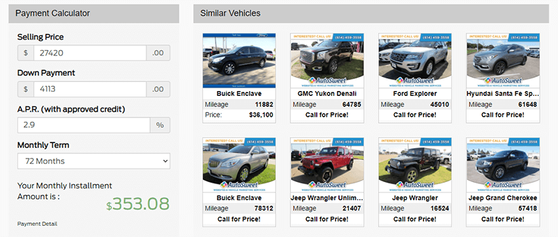
This builds trust, interest, and brand recognition, increasing the chances you’ll get a lead.
Improving Your Website Is Table Stakes
Your website is the digital expression of your dealership, and in most cases, it’s the first interaction that tech-savvy, time-strapped potential customers have with you.
You’ve invested time and money in building a web presence for your business, so make sure it works hard for you.
Make your VDPs user-friendly, eye-catching, and compelling with these simple tips, and then measure. Watch metrics like time on site and bounce rate on Google Analytics for a few months for signs of improvement, and track your leads, too.
Or, contact AutoSweet to do it for you! Optimize your website to improve leads and sales today. Fill out the form below to schedule a free strategy session with one of our digital marketing consultants.
